

The difference between a food brand that looks like a real, established business and one that looks like a hobby is often just the fonts. Not fancy fonts, not expensive ones, just a clean, consistent pair used the same way everywhere. Most home food vendors either grab whatever looks cute in the moment or cram three mismatched fonts onto one label, and both read as amateur. This guide walks through choosing fonts that make your food brand look established, from the font types to the label rules to where to get fonts you can legally use.
The short version: Fonts make a brand look established through consistency and restraint, not decoration. Pick one heading font with personality and one clean, highly readable body font, then use that exact pair everywhere: label, logo, storefront, and social. Match the style to your story, serif for traditional and warm, sans-serif for modern and clean, script only as a small accent. Keep ingredient and allergen text in the plain body font at a legible size, since food labels have legal minimums. Get your fonts free from a library like Google Fonts, whose license allows commercial use. Homegrown gives you a clean storefront to apply your brand consistently, though the font choices are yours to make.
This guide covers why fonts signal credibility, the font types, how many to use, label legibility, licensing, mistakes, and testing. This is general information, not legal advice.
Fonts make a brand look established through consistency and restraint, not through how fancy or trendy they are, because a professional brand uses the same small set of fonts the same way across everything it touches. The signal isn't any single beautiful font, it's the discipline of repeating one clean system everywhere.
What actually reads as "established":
The opposite, a logo in one script, a label headline in another, and ingredients in a third, reads as thrown together no matter how nice any single font looks alone. The takeaway: your fonts look established when they're consistent and restrained, not when they're elaborate. The rule is to pick a small system and repeat it religiously, which is the foundation of a coherent one-person food brand.
There are four main font categories, serif, sans-serif, script, and display, and each sends a different signal, so you match the type to your brand's story. Getting this right means your fonts reinforce what your brand is about instead of fighting it.
Here's how the categories compare:
| Font type | Reads as | Best for | Watch out for |
|---|---|---|---|
| Serif | Traditional, warm, artisanal | Jam, bakery, heritage recipes | Can feel dated if too formal |
| Sans-serif | Modern, clean, minimal | Meal prep, health, modern kitchen | Can feel cold without warmth elsewhere |
| Script | Personal, handmade | A logo or accent word only | Illegible as body or fine print |
| Display | High personality, bold | A single headline word | Never for body text |
A few notes on each:
The takeaway: pick the type whose signal matches your story, a warm serif for a heritage jam, a clean sans-serif for modern meal prep. The rule is that your font should say the same thing your brand does, and it pairs with a clear brand story.
You should use one or two fonts, almost never three, and never four or more, because every additional font makes a brand look less coherent, not more expressive. This is the single most common branding mistake for small vendors, and the easiest to fix.
The simple system:
The two fonts don't have to be a serif and a sans-serif. Often a low-contrast pairing from the same type family works better and is harder to get wrong. The takeaway: two fonts is your ceiling, and one used well is perfectly professional. The rule is that when in doubt, remove a font rather than add one, since restraint is what reads as established.
You pick label fonts by putting legibility first: reserve your script or display font for the brand name only, and set all the important information, ingredients, allergens, net weight, in your plain, readable body font at a legible size. The label is your highest-stakes surface because the type is smallest and the information matters most.
The label legibility rules:
Legibility research from usability experts consistently finds that decorative and handwriting-style fonts reduce how easily readers recognize characters, which is exactly what you can't afford on an allergen line. The takeaway: your label's job is to be read, so keep personality in the name and clarity everywhere else. The rule is that legibility beats beauty on a label, every time, and the specifics live in the guide on cottage food labeling requirements.
You get fonts you can legally use from free, openly licensed libraries like Google Fonts, whose fonts are cleared for commercial use on packaging and products at no cost. This matters because putting a font on a product you sell is commercial use, and not every free-looking font actually allows it.
The safe sourcing options:
The common worry, "can I really put this font on a jar I sell?", has a clear answer for openly licensed fonts: yes. The takeaway: source from a properly licensed free library so your brand is built on fonts you're allowed to sell with. The rule is to confirm commercial use is permitted before you fall in love with a font, the same way you'd check any tool, like the free tools for a DIY logo.
The mistakes that make a food brand look amateur are almost always about using too many fonts, using an illegible one, or distorting type, not about picking a font that's insufficiently fancy. Avoiding a short list of specific errors does more for your brand than any single "perfect" font choice.
The mistakes to avoid:
The takeaway: looking established is mostly about not making these specific mistakes, which is entirely within your control. The rule is that a clean, legible, consistent font beats a fancy, distorted, or overused one every time, no matter how nice the fancy one looked in isolation.
You test a font choice cheaply by seeing it at real size and getting a cold reaction from someone who doesn't know your intent, before you print hundreds of labels or build your whole brand on it. A few minutes of testing catches the legibility and vibe problems that only show up in the real world.
Simple, free tests:
The takeaway: test before you commit, because a font choice is cheap to change on a mockup and expensive to change on a thousand printed jars. The rule is to see it real and get an outside reaction before you scale it, so your final choice is proven, not just hoped.
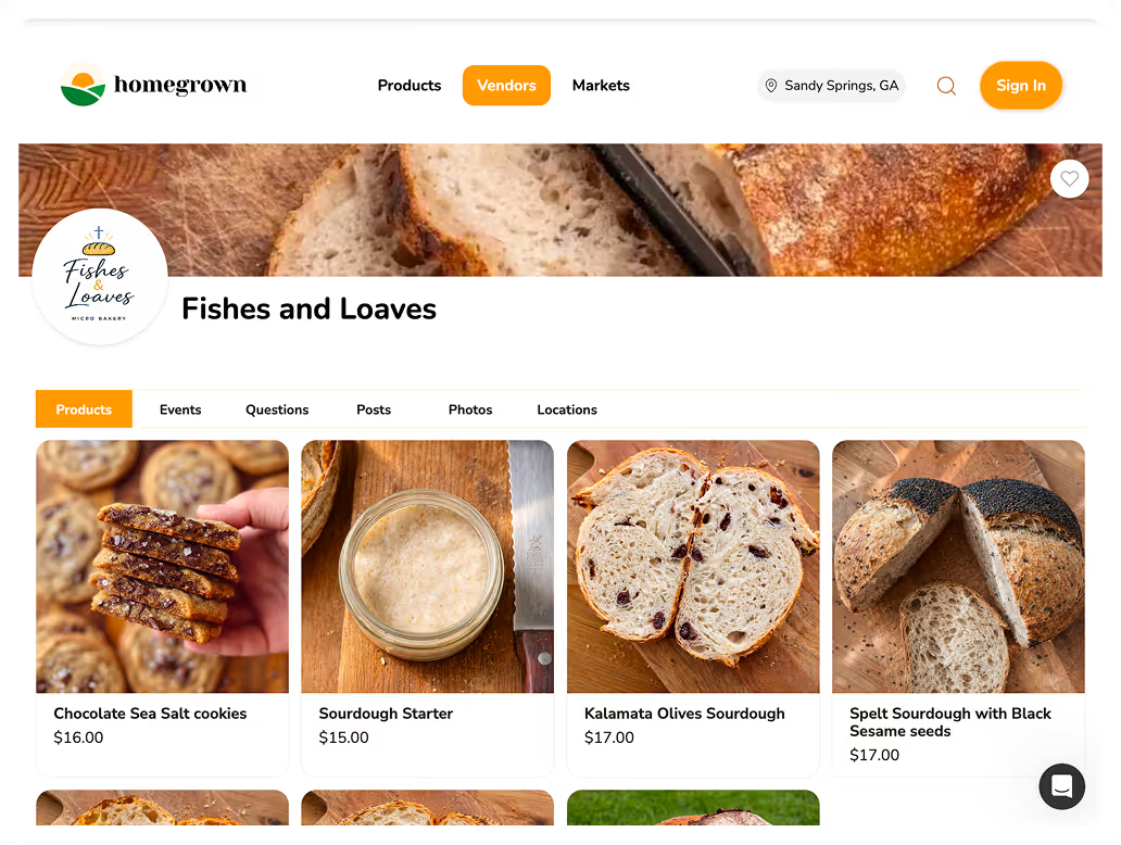
Choosing the right fonts is only half the job. The other half is applying them consistently everywhere your brand shows up, and your online storefront is one of the biggest of those surfaces. Homegrown is a $10-per-month online storefront, with no percentage fees beyond standard payment processing, that gives your food brand a clean, professional home online to sit alongside your labels and packaging.
A consistent brand is one where your storefront, your labels, and your social all feel like the same business. A clean storefront with your product names, your story, and clear photos reinforces the same established impression your carefully chosen fonts create on your jars, so a customer who finds you online sees a real business, not a scattered hobby. That consistency across every touchpoint is exactly what makes a small vendor look established.
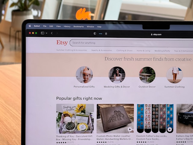
To be clear about what Homegrown does not do: it is not a design tool, and it will not choose your fonts, design your logo, or lay out your labels. Those creative decisions are yours, using free tools and the guidance here. Unlike piecing together a general website builder or a marketplace like Etsy, Homegrown gives local food sellers a purpose-built storefront at a flat, predictable price, so your professional brand has a professional place to live. Once your fonts and look are set, set up your Homegrown storefront and give your brand a consistent home online.
One or two, almost never three, and never four or more. Use one heading font that carries your brand's personality for your name and headlines, and one clean, highly legible body font for descriptions, ingredients, and fine print. The most common branding mistake small vendors make is using too many fonts, which reads as scattered and amateur. When you're unsure, remove a font rather than add one. Two well-chosen fonts used consistently everywhere look far more established than a pile of pretty ones.
There's no single "professional" font, since the right style depends on your brand's story. Serif fonts read as traditional, warm, and artisanal, which suits heritage, bakery, and preserve brands. Sans-serif fonts read as modern and clean, which suits health-forward or contemporary brands. What actually makes any of them look professional is using it consistently and legibly across your label, logo, storefront, and social, rather than the font being fancy. Consistency and restraint signal "established" far more than decoration does.
Yes. Google Fonts run on the SIL Open Font License, which explicitly permits use in logos, on packaging, and on physical products for commercial purposes, with no royalties and no attribution required. That covers putting a font on a jar, a label, or any product you sell. For fonts from other sources, always check the actual license first, since some free fonts are licensed for personal use only and would create legal risk if you used them on a product you're selling.
Food labels have federal minimums. Under FDA labeling rules (21 CFR 101.9), mandatory information generally can't be smaller than 8 point, serving size must be at least 10 point bold, and everything must be in a single easy-to-read type style using upper and lowercase letters, with adequate contrast. Beyond the legal floor, keep ingredients and allergens in your plain, legible body font, dark text on a light background, never in a script or low-contrast color, so the most important information is always easy to read.
Only as a small accent, like your brand name or a single word, never for body text, ingredients, or fine print. Script and handwriting fonts feel personal and handmade, which is appealing for a logo, but legibility research consistently shows decorative fonts reduce how easily people can read the actual characters. So a script can add warmth as an accent, but everything a customer actually needs to read, especially on a label, should be in a clean, plain font. Personality in the name, clarity everywhere else.
Print your label at actual size and look at it from arm's length, since most legibility problems only appear at true scale rather than zoomed in on a screen. Then get a cold read: show a friend a photo with no context and ask what kind of food brand it looks like, and see if their answer matches your intent. Finally, mock the same fonts on a label, a social post, and a small sign to check they hold up consistently across surfaces before you commit to a print run.
Fonts are one of the cheapest ways to make a home food business look like a real, established brand, and it comes down to restraint: one or two fonts, chosen to match your story, used consistently and legibly everywhere. Get that right and your labels, packaging, and storefront all start pulling in the same direction. Start your Homegrown storefront and give your well-branded products a professional place to sell.