

You're launching your food business, and you need a logo, but you don't have a designer's budget or skills. The good news is that you don't need either to create a clean, professional-looking logo that works. With free tools and a few solid principles, you can DIY a logo that represents your brand well and looks the part on your labels, storefront, and packaging. It won't be a fancy custom design, but for a small food business just starting out, a simple, clean, appropriate logo is exactly what you need, and you can always upgrade later. This guide walks through how to design a DIY logo with free tools, the principles that make a logo work, and the mistakes that make one look amateur.
The short version: You can create a solid DIY logo for free using accessible design tools, no designer or budget required. The key is keeping it simple and clean: choose a readable font, a simple concept or icon (if any), and a color or two that fit your brand, and avoid the clutter and gimmicks that make DIY logos look amateur. A good starting logo is legible at any size, works in one color, and suits your food and vibe. It doesn't need to be elaborate, simple and clean beats fancy and cluttered. Design something that works now, and upgrade to a custom logo later if and when you want. Just make sure your design is your own and doesn't copy someone else's.
This guide covers how to approach a DIY logo, the principles that make one work, free tools to use, and what to avoid.
A good logo, especially a DIY one, is simple, clean, legible, and appropriate to your brand, it works at any size, reads clearly, and suits your food, without relying on complexity or gimmicks. Simplicity is what makes a DIY logo look professional.
Principles of a good logo:
Why simplicity matters most for DIY:
The single most important principle for a DIY logo is simplicity. The best logos, from the world's biggest brands to a local food business, are clean and uncluttered, and simplicity is exactly what makes a self-made logo look professional rather than amateur. A simple logo, a readable font, maybe a simple icon, a color or two, is both achievable with free tools and inherently versatile, working at any size and in any context. Complexity, on the other hand, is where DIY logos fail: gimmicky effects, too many elements, and cluttered designs are what scream "made by an amateur." So aim for clean and simple, legible, appropriate to your food's vibe, and versatile. A logo represents your brand, and even a trademark can protect it, the U.S. Patent and Trademark Office's trademark basics explain how, so make sure your design is genuinely your own.
You approach your DIY logo by first defining your brand's vibe, then choosing a simple direction, a font-based wordmark or a font plus a simple icon, in colors that fit, keeping it clean and appropriate. Plan the direction before you start clicking.
Steps to approach your logo:
Why this approach works:
The best way to approach a DIY logo is to plan your direction before diving into a tool. Start by defining your brand's vibe, the feel you want to convey, because that guides every choice. Then pick a simple, achievable logo type: a wordmark (your business name in a well-chosen font) or a wordmark with a simple icon are ideal for DIY, since they're both effective and within reach of free tools. Choose a readable font that matches your vibe, add a simple relevant icon only if it genuinely helps (a clean wordmark alone often beats a forced icon), and limit yourself to one or two fitting colors. Keep everything clean and balanced. This planned, restrained approach, direction first, few elements, is what produces a DIY logo that looks intentional and professional rather than random and amateur.
You can use various free, accessible online design tools that offer templates, fonts, and easy editing to create a logo without design software or skills. These tools make DIY logo design genuinely doable.
Types of free tools available:
Tips for using these tools:
A range of free, accessible online tools make DIY logo design genuinely achievable, no design software or skills required. Free web-based design platforms with templates, fonts, and drag-and-drop editing are a common starting point, as are dedicated free logo makers that guide you through the process. Free font and icon libraries give you quality typography and simple icons to work with (always check that they're licensed for commercial use). The key with any tool is to use it in service of a clean, simple design, start from a tidy template or a simple blank canvas rather than an over-decorated one, keep your font and color choices cohesive, and export your finished logo at good quality in usable formats. These tools give you everything you need; restraint and good principles are what turn their capabilities into a professional-looking result.
You should upgrade to a professional logo when your business has grown, you have the budget, and a custom design would meaningfully help, but a good DIY logo serves you well until then. There's no rush, and starting DIY is completely fine.
When upgrading makes sense:
Why there's no rush:
There's genuinely no rush to get a professional logo, a good DIY one serves a starting food business perfectly well, and your food, service, and brand experience matter far more to customers than whether your logo came from a designer. Upgrade when it makes real sense: your business has grown, you have the budget without strain, and a custom design would meaningfully help (or your DIY logo has started to feel limiting). Until then, a clean, simple DIY logo does the job, and starting DIY doesn't lock you in, you can always invest in professional design later. In fact, spending your limited early budget on essentials rather than a logo is often the smarter call. Think about this as part of growing your business thoughtfully, which the U.S. Small Business Administration's guidance on growing your business supports.
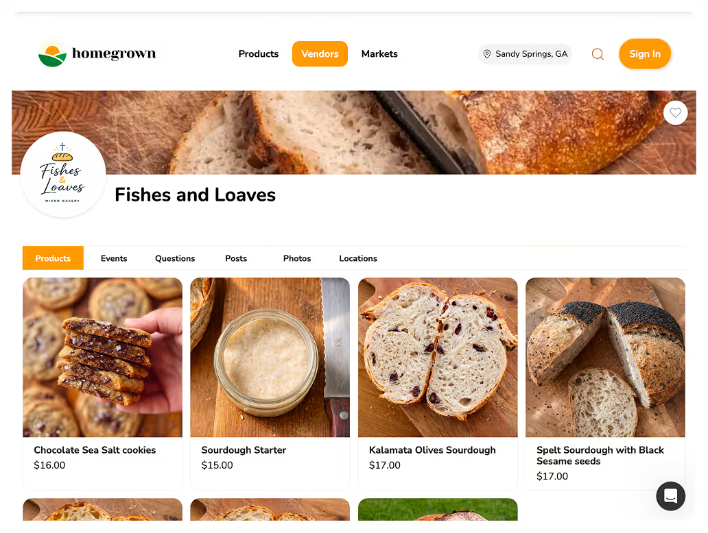
Once you have a logo, you need a professional storefront where it represents your brand to customers. Homegrown is $10 a month with no percentage fees beyond standard payment processing, giving you a storefront, built for local food vendors, where your logo and brand come to life.
How it compares to the alternatives:
What Homegrown does well: a professional storefront where your logo and brand identity are presented cleanly, clean payment handling, and a fifteen-minute setup, giving your DIY logo a professional home. A clean storefront makes even a simple logo look polished and legitimate. When you're ready to put your brand to work, you can set up your storefront today.
The biggest mistakes are over-complicating the design and using gimmicky effects or too many elements, which make a DIY logo look amateur. Because simplicity is what makes a DIY logo work, the errors that matter most involve clutter and excess.
Mistakes to avoid:
Getting these right means keeping your logo simple, clean, legible, and original, which is exactly what makes a DIY logo look professional.
Yes, you can create a solid, professional-looking logo yourself for free using accessible online design tools, no designer or budget required. The key is keeping it simple and clean: a readable font, a simple concept or icon (if any), and one or two fitting colors, while avoiding the clutter and gimmicks that make DIY logos look amateur. A good starting logo is legible at any size, works in one color, and suits your food's vibe. It doesn't need to be elaborate to work well, in fact, simple beats fancy. For a starting food business, a clean DIY logo is exactly what you need, and you can upgrade later.
Simplicity is the biggest factor. Professional-looking logos are clean, simple, legible, and appropriate to the brand, while amateur ones tend to be cluttered, use gimmicky effects (drop shadows, gradients, bevels), cram in too many elements or colors, or use hard-to-read novelty fonts. For a DIY logo, the path to looking professional is restraint: a readable font, a simple design, one or two colors, and no gimmicks. Complexity is where DIY logos fail, so the more you simplify and clean up your design, the more professional it looks. A clean wordmark often beats a busy design with a forced icon.
You can use free online design platforms that offer templates, fonts, icons, and drag-and-drop editing (many have free tiers), dedicated free logo makers that guide you through the process, free font libraries for quality typography, free icon libraries for simple icons, and basic free image editors for refinement. Always check that any fonts, icons, or elements are licensed for commercial use. Start from a clean template or simple blank canvas rather than an over-decorated one, keep your selections cohesive and simple, and export your finished logo at good quality in usable formats for labels, web, and print.
Either can work, but for a DIY logo, a clean wordmark (just your business name in a well-chosen font) is often the safest and most effective choice, and adding an icon only helps if the icon is simple, relevant, and genuinely improves the design. A forced, clichéd, or cluttered icon can make a logo worse, so don't add one just to have one. If you do use an icon, keep it simple and cohesive with your wordmark. Many excellent logos are wordmarks alone. Start with a clean wordmark, and add a simple icon only if it clearly strengthens the result rather than complicating it.
No, you don't need a professional logo to start, a good DIY logo serves a starting food business perfectly well, and customers care far more about your food, service, and overall experience than whether your logo came from a designer. Starting with a clean, simple DIY logo is completely fine and lets you spend your limited early budget on essentials instead. You can always upgrade to a professional, custom logo later, when your business has grown, you have the budget, and a custom design would meaningfully help. Starting DIY doesn't lock you in, so there's no need to wait or overspend on branding early.
Design your logo yourself from your own ideas rather than copying an existing logo, and avoid closely imitating another business's design, both to be genuinely original and to avoid potential trademark issues. When using free templates, fonts, or icons, customize them into something that's distinctly yours rather than leaving them generic, and make sure everything you use is licensed for commercial use. A logo can be a valuable, protectable brand asset (even trademarkable), so it should be your own creation. If you're ever concerned about whether your design might conflict with an existing trademark, that's a question for a trademark professional.
You don't need a designer or a budget to create a solid logo, with free tools and the principle of simplicity, you can DIY a clean, professional-looking logo that represents your food business well. Keep it simple, legible, appropriate, and original, avoid clutter and gimmicks, and upgrade to custom design later if you want. And to give your logo a professional home where your brand comes to life, set up a Homegrown storefront built for local food vendors.