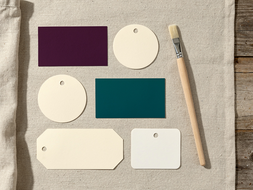


Walk any farmers market or scroll any "small batch" hashtag and you'll see the same palette over and over: kraft brown, sage green, and cream. It's become the default look for handmade food, which means it no longer helps you stand out, it makes you blend in. A distinct color palette is one of the cheapest ways to look like a real, memorable brand instead of one more sage-and-kraft lookalike. This guide walks through choosing a brand color palette that stands out, stays appetizing, and reads clearly everywhere you use it.
The short version: Pick a small, deliberate palette of two or three colors, a dominant, a secondary, and an accent, chosen from your own product and story rather than whatever's trending. Use them in roughly a 60-30-10 balance and keep the total to two or three colors so the brand reads as intentional. Check that your text has enough contrast against its background to stay readable, since there are real accessibility thresholds for that. Then document your exact hex codes and use them identically across your label, storefront, and social. Homegrown gives you a storefront to apply your palette consistently online, though the color choices themselves are yours.
This guide covers why brands look samey, how many colors to use, choosing colors, color psychology, contrast, consistency, and mistakes. This is general information, not design or legal advice.
So many small food brands look the same because they all reach for the same on-trend palette, kraft brown, sage or olive green, and cream, without choosing colors deliberately from their own product or story. That look reads as "handmade," which is why everyone uses it, and that ubiquity is exactly why it no longer makes you stand out.
The samey-brand trap works like this:
The fix isn't to abandon looking natural or appetizing, it's to choose your colors deliberately, picking a dominant color that's uncommon in your specific food category while keeping cues that still read handmade. The takeaway: brands look the same because they follow the same trend instead of choosing on purpose, and choosing on purpose is how you break out. The rule is to build your palette from your own product and story, which is the heart of a distinct brand story.
A brand palette should have two or three main colors, not more, organized so one color dominates, a second supports, and a third accents. Keeping the palette small is what makes a brand look coherent and professional rather than chaotic, and it gives you a simple system to apply everywhere.
A common and reliable structure is the 60-30-10 balance, widely recommended by design authorities like Nielsen Norman Group:
| Role | Share | Where it goes |
|---|---|---|
| Dominant | ~60% | Your biggest surfaces: label background, packaging, storefront banner |
| Secondary | ~30% | Supporting areas and neutrals |
| Accent | ~10% | Call-to-action buttons, highlights, a ribbon or seal |
How to think about each role:
The takeaway: two or three colors in a 60-30-10 balance gives you a professional, repeatable system, while four or more colors reads as busy. The rule is to cap your palette small and assign each color a job, so your brand looks decided rather than accidental.
You choose standout-but-appetizing colors by starting from your actual product and story, then picking a dominant color that's less common in your food category while keeping the palette food-friendly. The goal is to look different from your direct competitors without looking wrong for food.
A simple process for a non-designer:
The takeaway: distinctiveness comes from choosing a dominant color your competitors aren't using, anchored in your own story, not from being loud for its own sake. The rule is to stand out within the bounds of looking good with food, and to pair the palette with fonts that match, as covered in the guide on choosing food brand fonts.
Color psychology for food is real but soft: colors carry loose, culturally shaped associations, warm tones with appetite, greens with freshness, but the effect depends on product, culture, and context, so treat it as a lean to consider, not a rule to obey. It's a genuine research area, not a reason to overthink your palette.
What the honest picture looks like:
The takeaway: use color associations as a gentle guide, lean warm if you want appetite-forward, lean green if you want fresh, but don't let a color-meaning chart override a palette that's distinctive and true to your brand. The rule is to treat color psychology as a soft signal, one input among several, never a formula.
You make sure your colors stay readable by checking that any text has enough contrast against its background to meet accessibility standards, because a palette that looks pretty but fails contrast makes your label and storefront hard to read. This is both a usability issue and, for a public storefront, an accessibility one.
The contrast rules to follow:
The takeaway: a beautiful palette that fails contrast is a broken palette, so check every text-on-color combination against the real thresholds. The rule is that readability is non-negotiable, so reserve low-contrast pairings for decoration only, never for anything a customer needs to read.
You keep your colors consistent by documenting your exact hex codes in one place and reusing those precise values identically across your label, storefront, and social, instead of eyeballing "roughly that green" each time. Consistency is what turns three colors into a recognizable brand, and it depends entirely on using the same exact values every time. Your market table is the biggest surface that palette will ever sit on, and these market stall decor ideas show how to pick a cloth color from the color wheel, like green under red strawberries or blue under orange pumpkins.
How to lock in consistency:
The takeaway: consistency comes from documenting exact values and reusing them, not from remembering roughly what your colors were. The rule is to define the palette once, in precise codes, and apply it identically forever, which is how a small brand starts to look established, the same discipline behind a coherent one-person food brand.
The color mistakes that make a food brand look amateur are using too many colors, poor text contrast, colors that clash with your food photos, and simply copying your biggest competitor. Avoiding this short list does more for your brand than any single "perfect" color ever could.
The mistakes to avoid:
The takeaway: looking established is largely about not making these specific errors, all of which are within your control. The rule is that a small, high-contrast, documented palette that suits your food beats a large, trendy, or copied one every time.
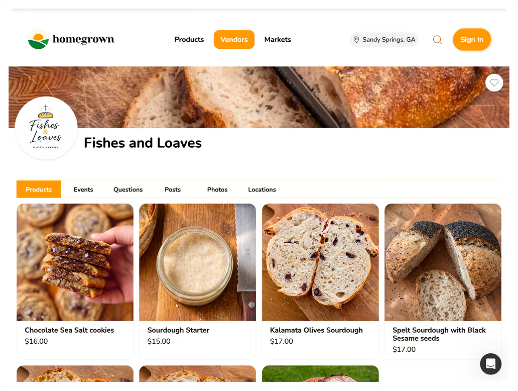
Choosing a distinctive palette is worth little if it only lives on your labels. Your online storefront is one of the biggest surfaces a customer sees, and it should carry the same colors as everything else. Homegrown is a $10-per-month online storefront, with no percentage fees beyond standard payment processing, that gives your food brand a clean, professional place online to sit alongside your packaging and social.
A brand looks established when its storefront, labels, and social all feel like the same business, and your color palette is a big part of what ties them together. When a customer who saw your distinctive jar at the market finds the same colors and feel on your storefront, that consistency reinforces that you're a real, considered brand, not a scattered hobby. Applying your documented hex codes to your storefront is a simple, high-impact way to make that connection.
To be clear about what Homegrown does not do: it is not a design tool, and it will not choose your palette, generate your colors, or design your labels. Those creative decisions are yours, using the process and free tools described here. Unlike stitching together a general website builder or blending into a marketplace like Etsy, Homegrown gives local food sellers a purpose-built storefront at a flat, predictable price, so your distinctive brand has a distinctive home online. Once your palette is set, set up your Homegrown storefront and apply your colors where customers buy.
Two or three main colors, organized so one dominates, a second supports, and a third accents. A common structure is the 60-30-10 balance: about 60 percent a dominant color on your biggest surfaces, 30 percent a secondary or neutral, and 10 percent an accent for buttons and highlights. Keeping the palette small is what makes a brand look coherent and intentional. More than three main colors tends to read as busy and unplanned, so when in doubt, use fewer colors more consistently rather than adding another.
Start from your own product and story rather than trends, and choose a dominant color that's uncommon in your specific food category. If every other product at your market uses kraft brown and sage green, a deep plum or warm teal will stand out on the same table while still looking appropriate for food. Build a small two- or three-color palette around that base color, keep it food-appropriate so it works with your product photos, and use it consistently. Distinctiveness comes from choosing on purpose, not from copying what's popular.
It's real but soft. Colors carry loose, culturally shaped associations, warm tones with appetite, greens with freshness, and it's a genuine research area studied by labs like Oxford's Crossmodal Research Laboratory. But the effect depends heavily on product, culture, and context, so no color guarantees a sale. Use these associations as a gentle guide, lean warm for appetite-forward or green for fresh, but don't let a color-meaning chart override a palette that's distinctive and true to your brand. Be skeptical of anyone quoting a specific sales-lift percentage for a color.
Any text needs enough contrast against its background to stay legible. The recognized standards, from the W3C's WCAG accessibility guidance, call for a contrast ratio of at least 4.5 to 1 for normal text and at least 3 to 1 for large text. You can test any color pair for free with the WebAIM Contrast Checker before committing it. This applies to both your storefront, where it's an accessibility requirement, and your printed labels, where it keeps ingredients and key information readable. Reserve low-contrast color pairings for decoration only.
Document your exact hex codes, the specific values like #2E7D32, not vague descriptions like "that green," and reuse those precise codes identically on your labels, storefront, and social. Build your social templates and storefront with the palette already applied so staying on brand is automatic. Slightly different shades across surfaces quietly make a brand feel off even when a customer can't pinpoint why, so precision matters. Define the palette once in exact codes, then apply those same values everywhere, forever.
You can look natural and handmade without defaulting to the exact kraft-brown-and-sage palette everyone else uses, which has become a cliché that makes you blend in rather than stand out. Keep the earthy, handmade cues if they fit your brand, but choose a distinctive dominant color from your own product or story so you're not identical to the next table over. The goal isn't to abandon looking natural, it's to look natural in a way that's recognizably yours rather than interchangeable with every other small-batch brand.
A distinctive color palette is one of the highest-impact, lowest-cost moves a small food brand can make, and it comes down to choosing deliberately: two or three colors from your own story, balanced, readable, and used consistently everywhere. Do that and you stop blending into the sea of sage and kraft. Start your Homegrown storefront and give your distinctive brand a place to sell.